

The Ultimate Guide to Choosing the Perfect Paint Colors for Any Space
Selecting the right paint color for a room isn’t just about aesthetics—it’s about creating an atmosphere that enhances the space’s purpose, reflects your personal style, and even influences your mood. Whether you’re refreshing a single room or painting an entire home, choosing the perfect paint color can feel overwhelming with endless options available. This guide will walk you through the essential steps to make an informed decision, from understanding color theory to considering practical factors like lighting and room size. By the end, you’ll have the confidence to pick colors that not only look beautiful but also work harmoniously with your lifestyle.
Understanding the Basics of Color Theory
Before diving into paint swatches, it’s helpful to grasp the fundamentals of color theory. Colors are typically categorized into three groups: primary (red, blue, yellow), secondary (green, orange, purple), and tertiary (mixes of primary and secondary colors). These colors form the basis of the color wheel, a tool that helps visualize relationships between hues. The three main color harmonies to consider are:
- Complementary Colors: Colors opposite each other on the color wheel, such as blue and orange, create high contrast and vibrancy when used together. This pairing works well for accent walls or decorative elements.
- Analogous Colors: Colors that sit next to each other on the wheel, like blue, teal, and green, offer a cohesive and calming effect. This scheme is ideal for spaces where you want a sense of harmony and flow.
- Triadic Colors: Three colors spaced evenly around the wheel, such as red, yellow, and blue, bring energy and balance. This combination is best used sparingly to avoid overwhelming a space.
Additionally, understanding color temperature—warm (reds, oranges, yellows) versus cool (blues, greens, purples)—can guide your choices based on the mood you want to evoke. Warm colors tend to energize and invite conversation, while cool colors promote relaxation and tranquility.
Assessing the Purpose of the Space
Every room serves a different function, and the paint color should align with its primary use. Here’s a breakdown of how to match colors to common spaces:
- Bedrooms: Opt for soft, soothing hues like lavender, sage green, or warm beige. These colors promote rest and relaxation. Avoid overly bright or stimulating colors, as they can disrupt sleep.
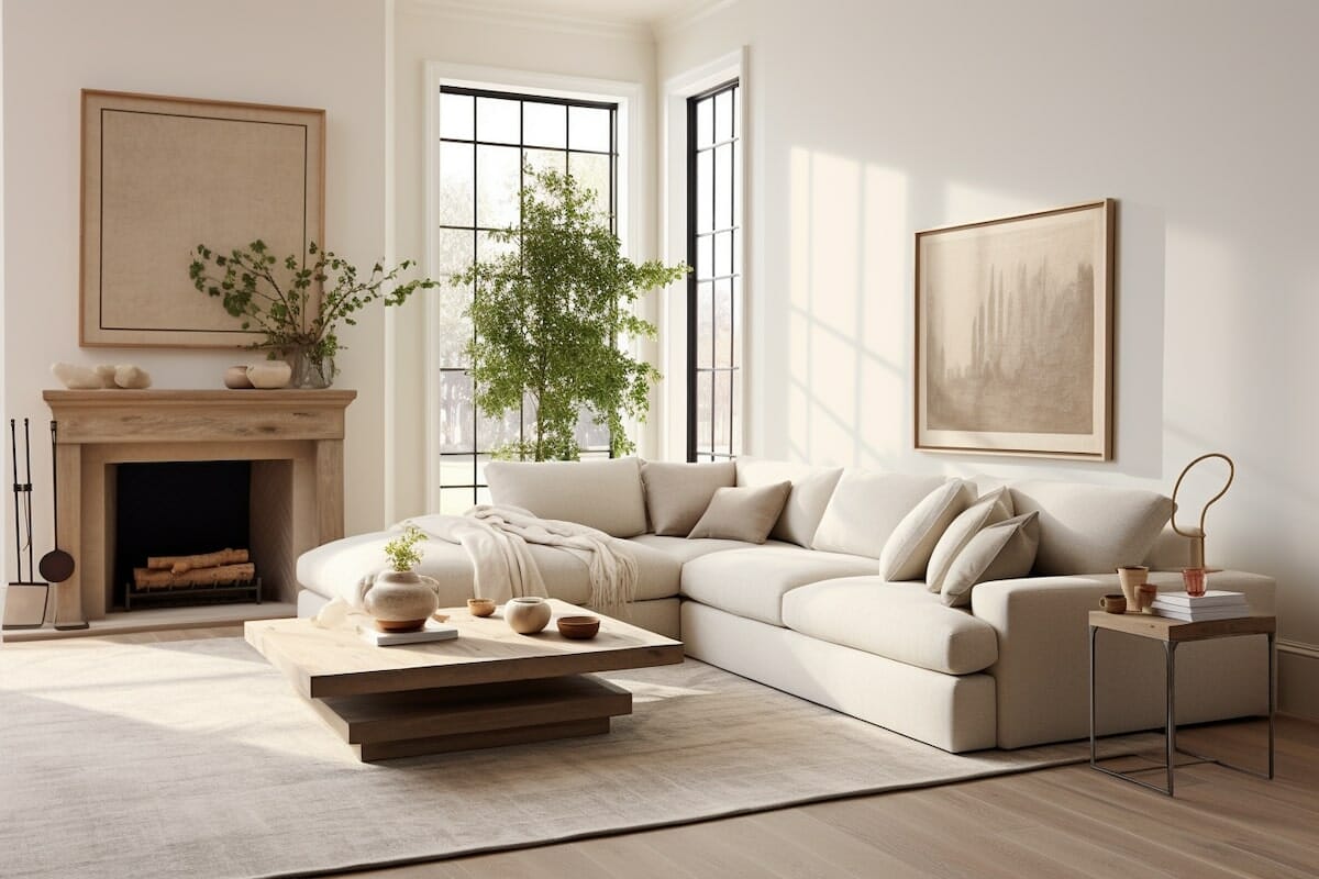
- Living Rooms: This social space benefits from warm, inviting colors such as soft neutrals, warm grays, or muted blues. These tones encourage conversation and comfort.
- Kitchens: Bright and energetic colors like yellow, red, or turquoise can stimulate appetite and create a lively atmosphere. If you prefer a more subdued look, consider soft greens or warm whites.
- Home Offices: Neutral tones like white, light gray, or soft blues help maintain focus and reduce distractions. If you want to add energy, consider an accent wall in a bold color like deep teal or burnt orange.
- Bathrooms: Cool, clean colors like crisp white, soft blue, or pale gray mimic the feeling of a spa and make small spaces feel larger. Avoid dark colors, which can make the room feel cramped.
Consider the emotional impact of colors as well. For example, blue is often associated with calmness, while red can evoke passion or urgency. Aligning the paint color with the room’s intended mood ensures a cohesive and functional space.
Evaluating Natural and Artificial Lighting
Lighting plays a crucial role in how paint colors appear. Natural light varies throughout the day and can shift the perception of a color from morning to evening. Artificial lighting, whether warm or cool, also influences the final look. Here’s how to account for lighting:
- North-Facing Rooms: Receive cool, indirect light, which can make colors appear bluer or grayer. Opt for warm hues or light-colored paints to balance the coolness.
- South-Facing Rooms: Get abundant natural light, which can make colors appear brighter and more saturated. Choose cooler tones or muted shades to prevent the space from feeling too intense.
- East-Facing Rooms: Enjoy warm morning light but cooler afternoon light. This shift can make warm colors look more vibrant in the morning and cooler in the afternoon. Consider versatile neutrals or soft pastels.
- West-Facing Rooms: Receive warm, direct light in the afternoon, which can enhance warm tones but may make cool colors look dull. Use warmer shades or add reflective surfaces to brighten the space.
When testing paint colors, apply samples to different walls and observe them at various times of day. Artificial lighting also matters—incandescent bulbs emit warm light, while LED or fluorescent lights can have a cooler tone. Always test paint samples in the actual room to see how they interact with your specific lighting conditions.
Choosing the Right Finish
The paint finish affects both the appearance and durability of the color. Different sheens offer varying levels of shine, texture, and resistance to wear. Here are the most common paint finishes and their best uses:
- Flat/Matte: Offers a velvety, non-reflective finish that hides imperfections well. Ideal for ceilings, adult bedrooms, or low-traffic areas. However, it’s less durable and can be difficult to clean.
- Eggshell: Slightly more durable than flat, with a soft sheen that’s easy to clean. Perfect for living rooms, hallways, and dining rooms where some durability is needed.
- Satin: A mid-sheen finish that’s highly durable and easy to maintain. Suitable for kitchens, bathrooms, and trim work. It resists moisture and stains but may show brush strokes if not applied carefully.
- Semi-Gloss: Shiny and durable, this finish works well for doors, cabinets, and trim. It’s moisture-resistant and easy to clean but highlights imperfections in the walls.
- High-Gloss: The most reflective and durable option, ideal for furniture, cabinets, or accent pieces. It’s highly resistant to wear but requires a perfectly smooth surface to avoid highlighting flaws.
For most walls, an eggshell or satin finish provides a good balance between aesthetics and practicality. High-gloss finishes are best reserved for trim or furniture where durability is a priority.
Testing and Narrowing Down Your Choices
With so many paint colors available, it’s easy to feel indecisive. Testing is the best way to ensure you love the final result. Follow these steps to narrow down your options:
- Use Paint Samples: Purchase small samples of your top choices and apply them to different walls in the room. Observe how they look in various lighting conditions and against your existing decor.
- Consider Undertones: Many paint colors have hidden undertones—warm, cool, or neutral—that can affect how they appear. For example, a white paint might lean slightly yellow or gray. Always check the color’s undertone to ensure it complements your space.
- Create a Mood Board: Gather inspiration from magazines, Pinterest, or home decor stores to visualize how different colors work together. This can help you identify patterns or color schemes that resonate with you.
- Get a Second Opinion: Show your top choices to friends or family for feedback. They might notice something you overlooked, such as how a color clashes with existing furniture or flooring.
Once you’ve tested a few options, narrow down your choices to two or three favorites. This will make it easier to make a final decision and ensure you’re fully satisfied with the outcome.
Avoiding Common Mistakes
Even with careful planning, it’s easy to make mistakes when choosing paint colors. Here are some pitfalls to avoid:
- Choosing Based on a Small Swatch: Paint colors can look dramatically different when applied to a full wall. Always test colors in the actual space before committing.
- Ignoring the Room’s Size and Shape: Dark colors can make a small room feel even smaller, while light colors can make a large space feel more open. Consider the room’s dimensions when selecting a color.
- Overlooking Existing Elements: Take into account your furniture, flooring, and decor. A color that clashes with your existing pieces can disrupt the harmony of the space.
- Following Trends Blindly: While trendy colors can be appealing, they might not stand the test of time. Opt for timeless shades that you’ll love for years to come.
- Forgetting About Ceiling and Trim: The ceiling and trim can frame your walls and impact the overall look. Consider painting ceilings a lighter color to make rooms feel taller, or use a contrasting color for trim to add definition.
By being mindful of these common mistakes, you can make a more informed and confident decision when selecting your paint colors.
Final Tips for a Flawless Finish
Once you’ve chosen the perfect color, it’s time to ensure a professional-looking result. Here are some final tips to achieve a flawless finish:
- Prep the Walls: Clean the walls thoroughly and repair any cracks or holes. Sanding and priming, especially over dark colors or stains, will ensure a smooth and even application.
- Use Quality Tools: Invest in high-quality brushes and rollers to avoid streaks and brush marks. A angled brush is ideal for cutting in edges, while a roller with a medium nap works well for smooth walls.
- Apply Two Coats: Most paint colors require two coats for full coverage, especially if you’re covering a dark color or using a bold hue. Allow the first coat to dry completely before applying the second.
- Consider a Professional: If you’re unsure about your painting skills or working with intricate details, hiring a professional painter can save time and ensure a high-quality finish.
With the right color choice and preparation, your freshly painted room will not only look stunning but also feel like a true reflection of your style and personality. Happy painting!
:strip_icc():format(webp)/kly-media-production/medias/2181065/original/067788900_1525753642-iStock-647402906.jpg "Ginger Spice Warm Tone")
